Wellness simplified


Overview
Maria is a certified nutritionist and CrossFit coach who’s passionate about helping people fuel their bodies with confidence and clarity. Her approach to nutrition is rooted in simplicity and balance—making healthy eating feel approachable so clients can feel like themselves again: energized, empowered, and in control.
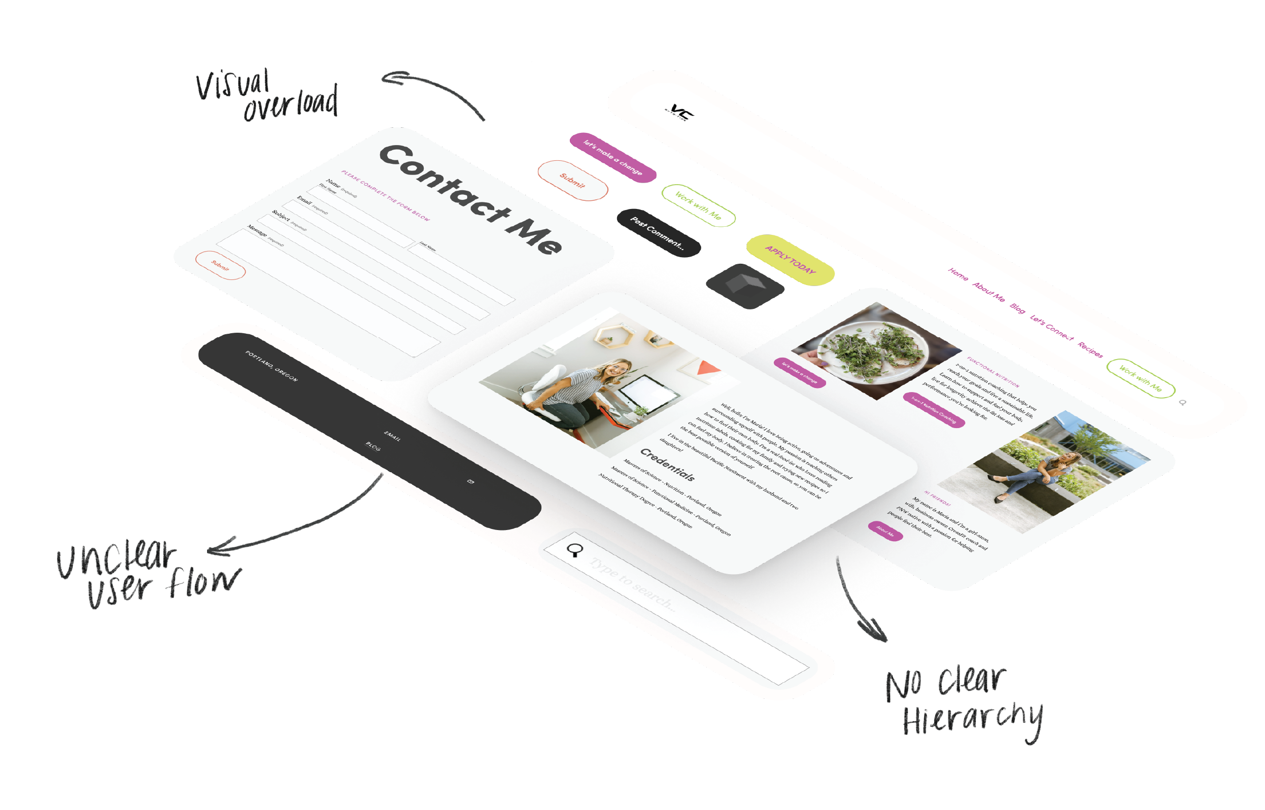
When Maria came to us, her existing website wasn’t getting much traffic or engagement. She wanted to change that.
Main goals
Create a warm, inviting online presence that authentically reflects her personality
Clearly highlight her services and credentials in a way that feels approachable, not overwhelming
Build trust with users through thoughtful language and visuals
Most importantly, drive more bookings for 1:1 coaching sessions by removing friction and guiding users toward action
By elevating the design and user experience, Maria aimed to better connect with people who are ready to improve their nutrition—and give them the confidence to take that first step.
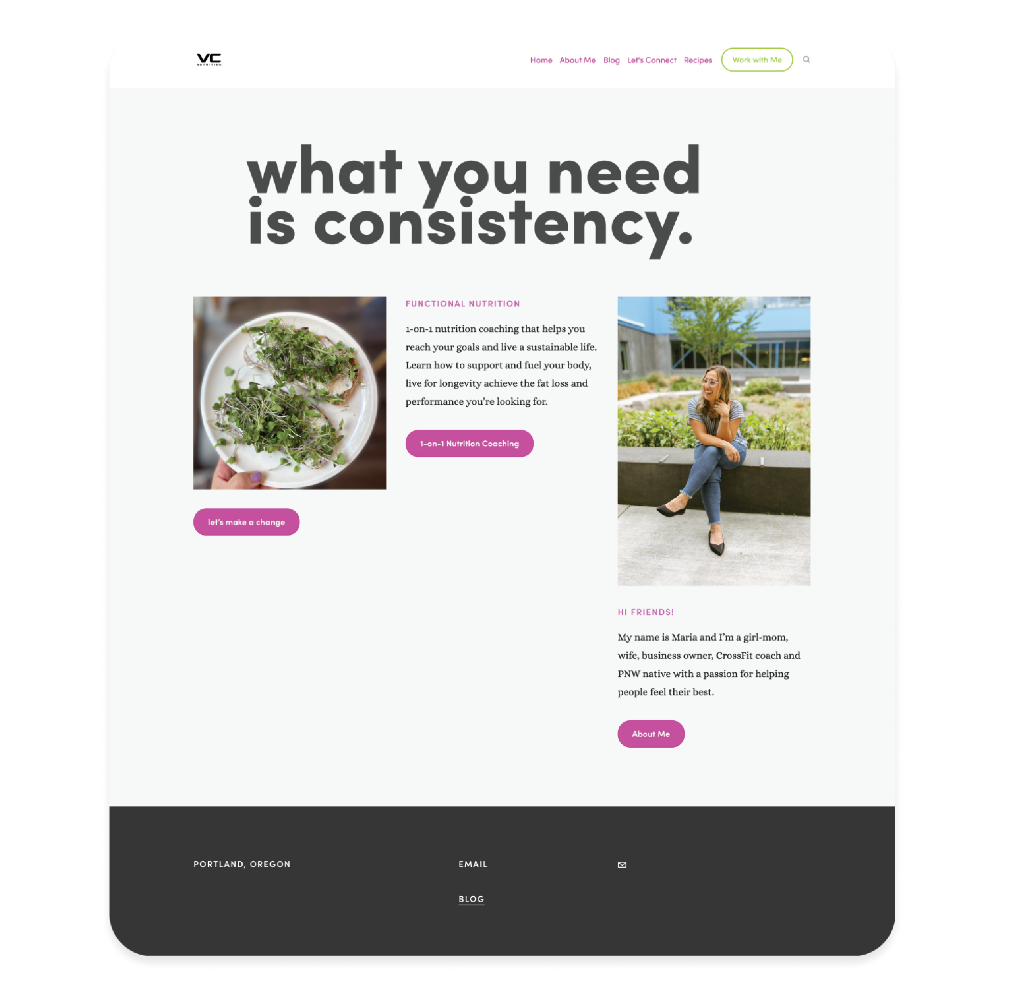
The before: Need for something fresh
My role
As part of a three-person team, I led the client relationship by bringing this stakeholder to the project. I conducted both stakeholder and user interviews to align business goals with user needs, ensuring our design decisions were rooted in real insights. I collaborated on refining the design direction, keeping both usability and client vision in focus.
In the final stages, I was responsible for setting up the functionality of our high-fidelity prototypes and fully building out the live website in Squarespace to accurately reflect the final design.
Timeline and scope
Over the course of a fast-paced three-week sprint, our team focused on redesigning three key pages of the VC Nutrition website: the Home page, About page, and 1:1 Coaching Sessions page.
Our design decisions were guided by the needs of our proto-persona, Sophie—a young social media influencer with a busy schedule, a passion for fitness, and a desire to clean up her diet without sacrificing balance. She looks for healthy, approachable recipes that are quick and easy to follow.
By keeping users like Sophie in mind, we aimed to create a warm and engaging experience that clearly communicates VC Nutrition’s offerings while encouraging users to take action—especially booking 1:1 coaching sessions.
Empathize:
Stirring up insights
We began by immersing ourselves in the experiences of both the target users and the stakeholder to better understand their goals, challenges, and motivations around nutrition.
User interviews and surveys helped us gather insights from individuals actively trying to improve their diet—what they struggle with, what motivates them, and what they’re looking for in a nutrition resource.
Stakeholder interviews clarified business goals and the values behind the 1:1 coaching services, giving us a clearer picture of what success looks like for the client.
We created a proto-persona, Sophie—a young, busy social media influencer who’s passionate about fitness and looking for simple, balanced nutrition guidance.
This foundation of empathy helped us design a user-centered experience that feels approachable, empowering, and aligned with real-life needs.

What we found
✺ Many people feel stuck
Busy schedules and advice overload make it hard to start
✺ Nutrition is more than food
It’s about confidence, clarity, and long-term support
✺ Guidance makes it real
The right help builds habits that truly last and work
Define: The prep work
With a clearer understanding of our users and stakeholder goals, we moved into defining the core problem and mapping out the experience.
A problem statement helped align our team on the core challenge: How might we create a welcoming, easy-to-navigate experience that encourages users to book a 1:1 nutrition session?
We created an empathy map and journey map to identify emotional touchpoints, uncover friction in similar nutrition platforms, and surface key opportunities for improvement.
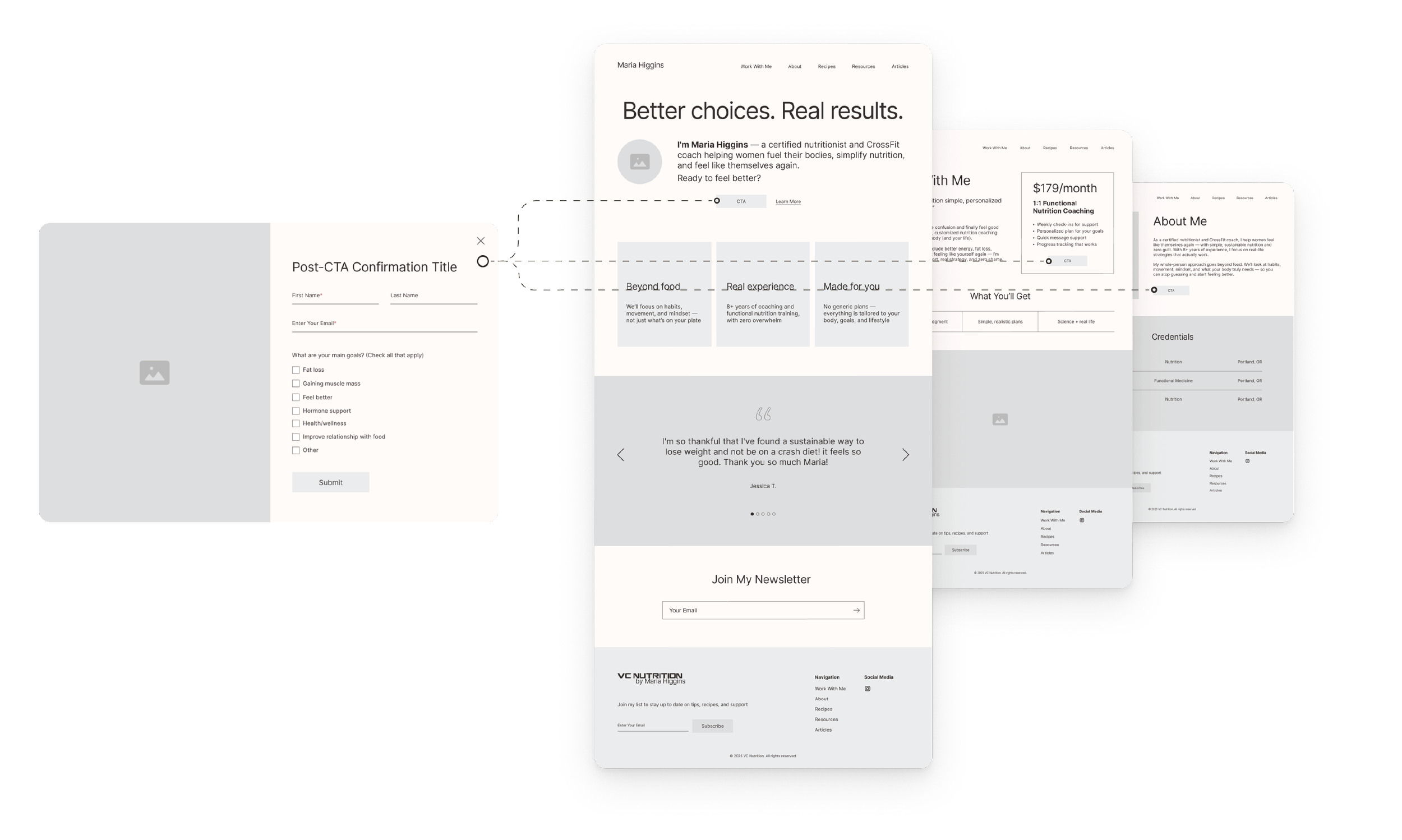
Before jumping into structure, we mapped the primary task flow—booking a 1:1 session. This ensured our design decisions supported both user goals and business objectives while reducing unnecessary steps along the way.

Ideate: Cooking up solutions
With a strong foundation of user insights and defined goals, we moved into solution generation, prioritization, initial prototypes, and high fidelity prototpes.
We used the MoSCoW method (Must-have, Should-have, Could-have, Won’t-have) to prioritize features based on user needs and timeline constraints. This helped us stay focused on what would have the most impact within our 3-week sprint.
With these insights in mind, we began translating ideas into polished, high-fidelity prototypes in Figma, focusing on clarity, warmth, and ease of use—especially around the 1:1 coaching flow.
This phase allowed us to transform research and strategy into visual, interactive solutions that addressed both user and business needs.
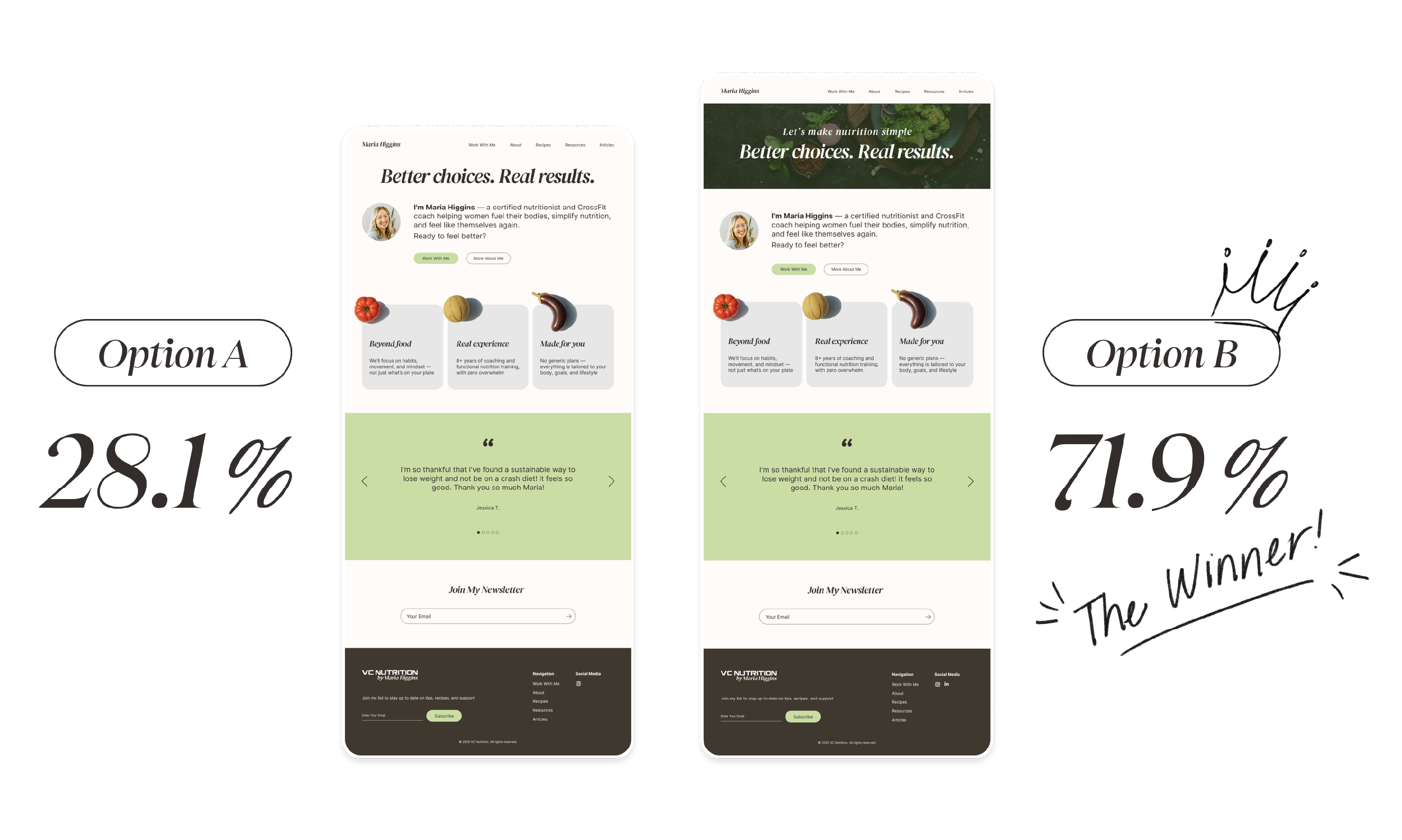
A/B taste test
To validate our design decisions, we conducted user testing focused on two homepage concepts.
We ran A/B testing to compare the effectiveness of each version in engaging users and communicating key messages.
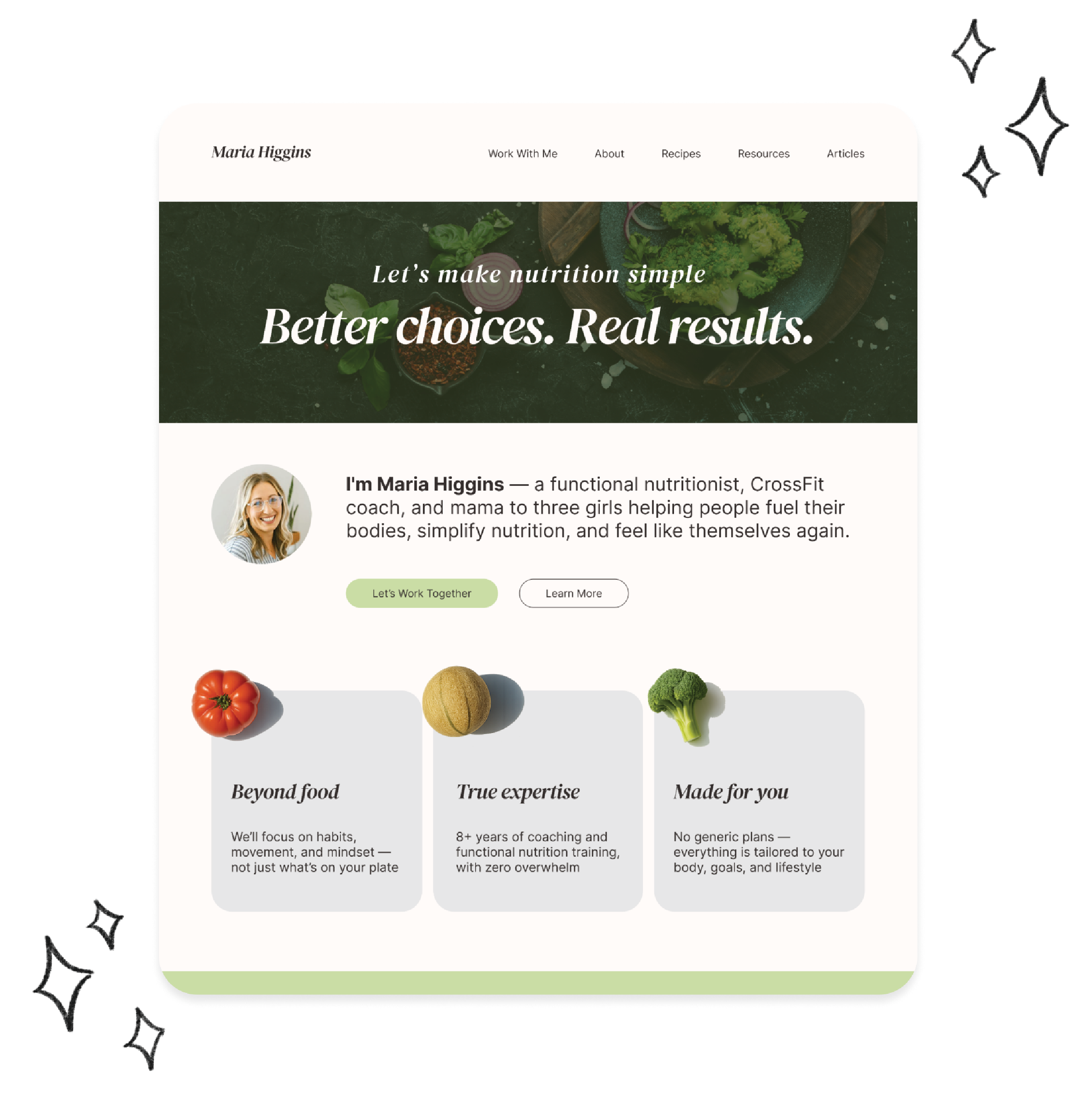
Version B, featuring a clear tagline paired with a compelling hero image, consistently resonated better with users—helping them quickly understand the brand’s value and offerings.
Based on this feedback, Version B became the foundation for our final design and UI system, guiding the rest of the site’s look and feel.
Takeaways and next steps: Serving a seamless experience
To validate our work, we conducted user testing focused on the “happy path” of booking a 1:1 coaching session with Maria. Feedback from this testing will guide refinements to improve clarity and ease of use.
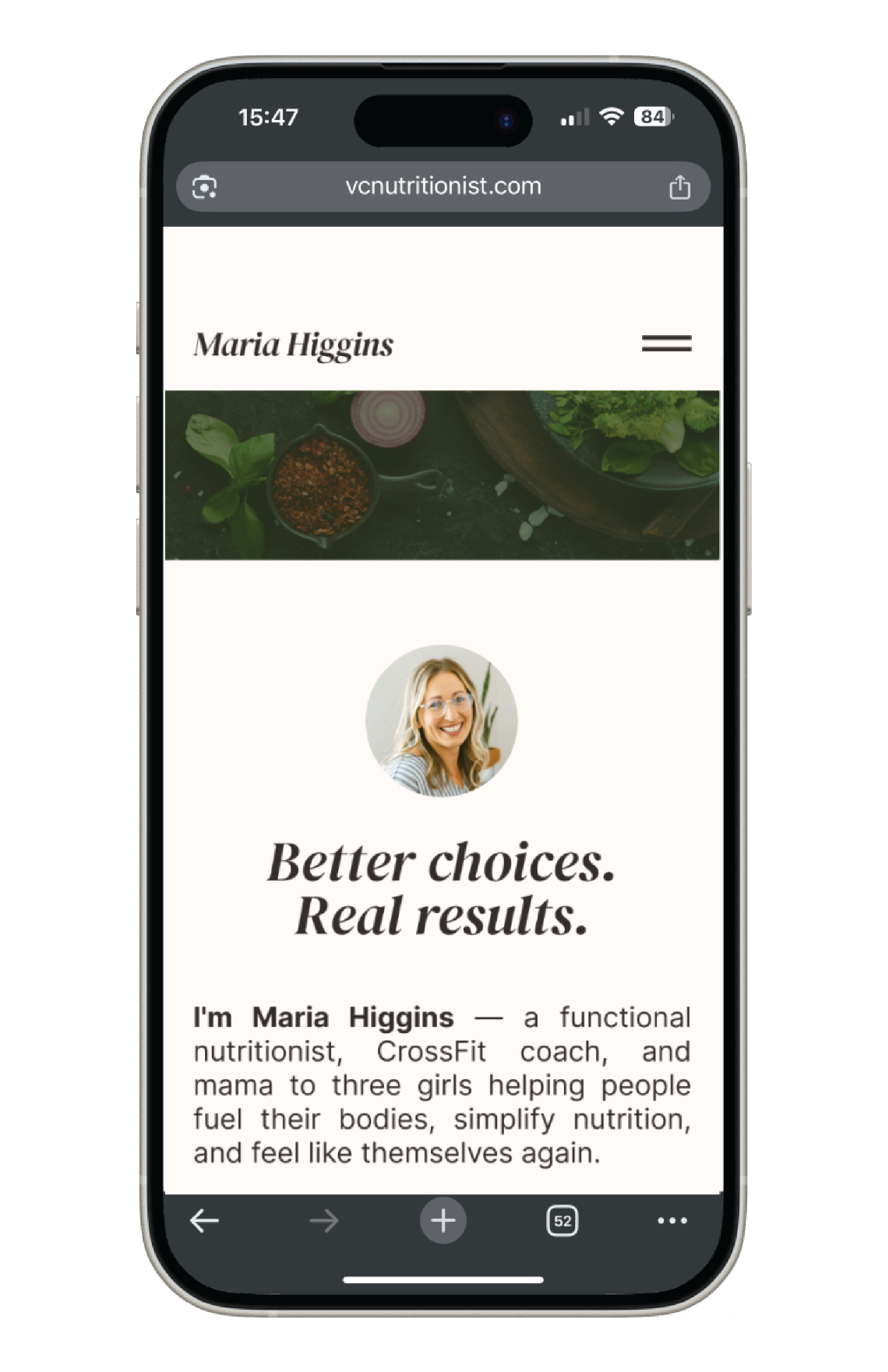
Using our final high-fidelity prototypes, we built out the key pages of the user flow—Home, About, and 1:1 Sessions—directly in Squarespace, bringing the experience to life with a clean, approachable aesthetic.
Maria was very pleased with the redesign, and we’re now in the process of officially launching her full website.

Looking ahead, our focus will shift to:
Expanding the site with recipes, resources, and articles to support users on their nutrition journey
Enhancing the 1:1 coaching page with more detail around the program—what it includes, how it works, and what clients can expect
Growing Maria’s bio to deepen trust and connection with users like Sophie by highlighting her credentials and personal story
Testing and optimizing the mobile experience to ensure it matches the desktop version in both clarity and visual quality
These next steps will continue to shape a user-centered experience that’s warm, informative, and action-driven.