Ink with impact
Overview
Ink Against Cancer (IAC)— Cancer Warriors Foundation is a grassroots nonprofit that unites artists to support cancer fighters and their families, with a special focus on young warriors. Despite their impactful creative events and outreach, their existing website presents usability challenges. Visitors often struggle to navigate the site, which can lead to fewer donations, diminished volunteer interest, and lower overall engagement.
My role
In our team of four, I served as the project manager, led user interviews, and assisted in establishing the visual style guide. I designed key components that formed the foundation of our prototypes, contributed to finalizing the website’s design, and connected the frames to build the interactive prototype.
Our team aligned around five key goals
1
Improve the site’s information architecture
Many users shared that they felt lost or overwhelmed trying to navigate the current site, so streamlining the navigation was essential. Our goal was to help users quickly and effortlessly find the information they need—whether that’s how to donate, volunteer, or learn more about the cause.
2
Build credibility and trust
A more modern, professional, and accessible interface would not only reflect the heart of the organization but also help foster confidence in secure donations and future partnerships.
3
Keep users engaged
We aimed to reduce frustration and cognitive load. We wanted to remove barriers that made actions like donating or signing up to volunteer feel difficult or unclear. A smoother experience meant users would be more likely to get involved.
4
Boost engagement
The new design needed to resonate with visitors—especially those like our persona, Myra—by creating a sense of connection and inspiring them to take meaningful actions.
5
Continuous improvement
We plan to achieve this by planning to gather qualitative feedback through usability testing. These insights would help validate our design decisions and guide future iterations to ensure the site continues to serve its community effectively.
Empathize: Art that gives back
To better understand our users, we began by creating a proto-persona centered on tattoo artists who are passionate about giving back to their communities. We then conducted interviews with tattoo artists and members of the general public who might be interested in attending events, volunteering, or supporting Ink Against Cancer financially. These conversations helped us uncover both motivations and barriers to engagement.

From this research, we developed an empathy map and refined our primary user persona
Myra Harrison — The Heart-Driven Artist. Myra is a passionate tattoo artist, a busy mother balancing freelance work, parenting, and a desire to make a meaningful impact. While she’s eager to contribute her time and talent, she often struggles to find clear, accessible ways to get involved due to a demanding schedule and limited resources.
Throughout the design process, Myra remained central to our decisions. Her values—authenticity, connection, and community—strongly align with Ink Against Cancer’s mission and guided our efforts to create a site that is easier to navigate, emotionally supportive, and more inclusive for users like her.
Define: Sharpening the experience
Original site

When we spoke with users like Myra, many shared that the website felt frustrating and confusing. Despite being eager to get involved, they often got lost trying to volunteer or donate—leaving them feeling discouraged and disconnected from the cause.
Our redesign focused on solving this by
Creating a modern, trustworthy, and cohesive look
Improving navigation so users can easily find what they need
Streamlining the volunteer process to turn interest into action
Myra’s journey highlights a gap, she starts excited, but broken links and outdated info lead to frustration. Fixing that experience became our core mission.
Design and prototype: Honoring the original sketch
Alongside structural improvements, we focused on refining the brand identity. We updated the color palette, brand voice, and UI components to better reflect Ink Against Cancer’s mission. The new visual direction leaned into a tone that is strong, energetic, feisty, and warm—mirroring the organization’s passionate support for cancer warriors and their families.
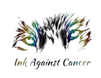
We also made the intentional decision to preserve the original wolf logo, which holds deep meaning for the IAC community. It symbolizes resilience, strength, and unity, and remains a powerful visual connection to the nonprofit’s roots.
With these foundational elements in place, our updated style guide informed the design of key components used throughout the interactive prototype. Every visual decision prioritized clarity and emotional impact, ensuring the final product felt trustworthy, supportive, and aligned with IAC’s values.
At this stage, our team also built functional prototypes in Figma to bring the redesigned experience to life. These clickable flows allowed us to test interactions, validate structure, and prepare for the usability testing phase.
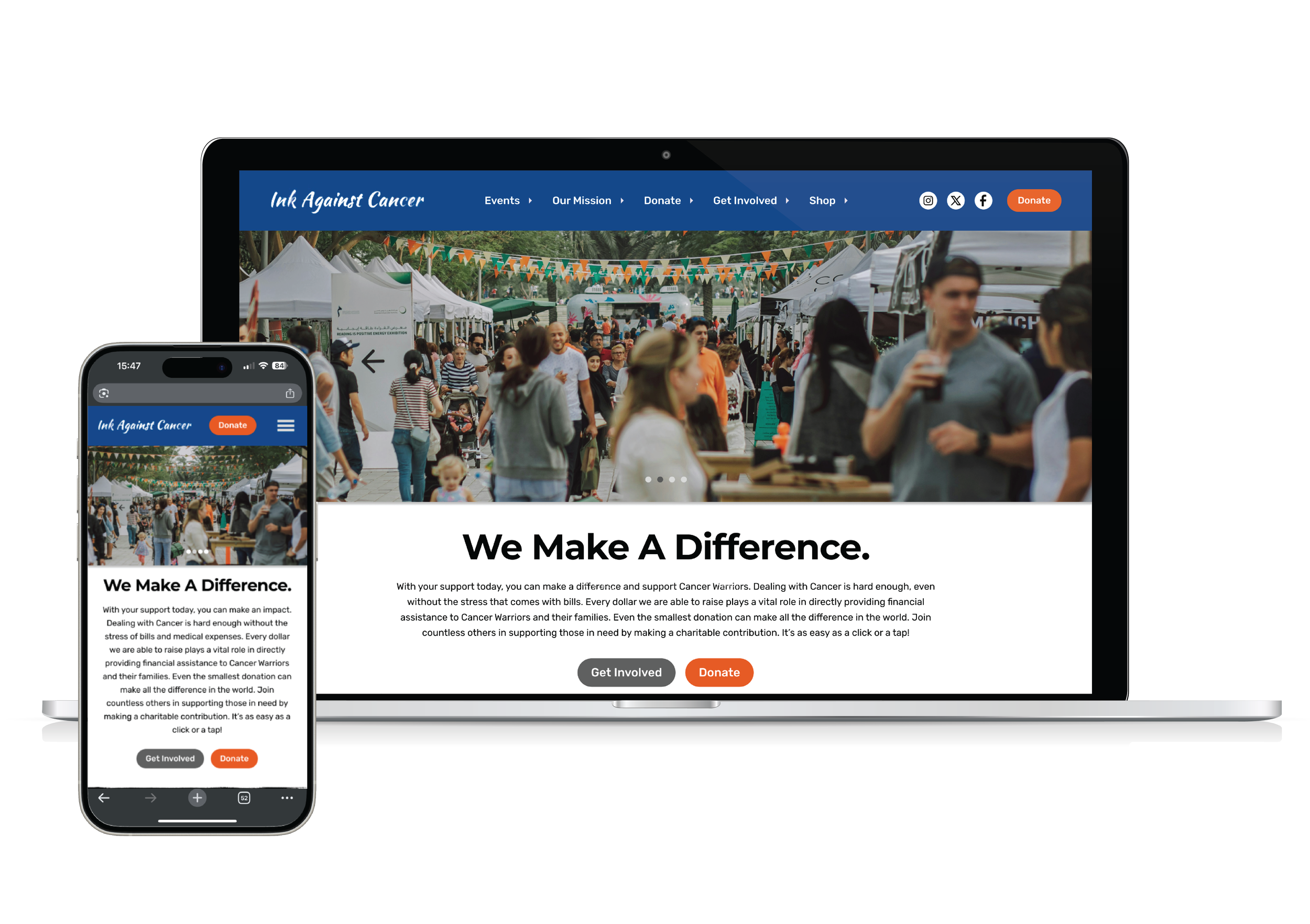
Updated mobile site

Conclusion and takeaways: The art of what’s possible
If our team were to continue this project, our next step would be to present our proposals to key stakeholders to ensure alignment with their current goals and needs. From there, we would focus on developing more effective and user-friendly ways for visitors to donate their money and time, while also exploring opportunities to introduce more interactive and engaging elements to the site.
Overall, we’re proud of the direction we took the Ink Against Cancer redesign. We believe the improved experience has the potential to significantly benefit the organization—and make it easier for passionate users to get involved, support the mission, and feel connected to the cause.

